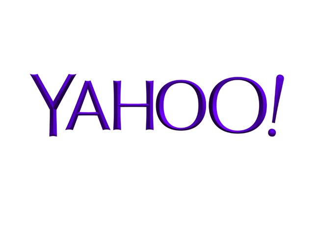
Yahoo has finally revealed their new official logo after 30-day campaign that had the tech company changing their logo every day. The change took place on Thursday (September 5), at the stroke of midnight. CEO Marissa Mayer wanted to make her mark in the search company and revamp the trademark symbol only keeping the characteristic purlple color scheme and the hue of the logo. "We wanted a logo that stayed true to our roots (whimsical, purple, with an exclamation point) yet embraced the evolution of our products," Kathy Savitt, Chief Marketing Officer, wrote on Tumblr.
At the beginning of the campaign Savitt said, "Over the past year, there’s been a renewed sense of purpose and progress at Yahoo!, and we want everything we do to reflect this spirit of innovation. While the company is rapidly evolving, our logo — the essence of our brand — should too. The new logo will be a modern redesign that’s more reflective of our reimagined design and new experiences. We also want to preserve the character that is unique to Yahoo! — fun, vibrant, and welcoming — so we’ll be keeping the color purple, our iconic exclamation point and of course the famous yodel. After all, some things never go out of style."
The new logo does not follow current design trends that opt for a flatter design. This new Yahoo logo does not have flat edges and employs a bevel and emboss to the font that gives it a retro look, reminding us of the beginnings of Google's logo. For people that have grown accustomed to the previous trademark, the change has not gone down too well. Here are some of the reactions that people on YouTube are expressing:
TheDecadeMoon: "Not liking the BEVEL. What happened to flat design?"
Ebizzill: "On the real Yahoo?! You had some other fonts throughout the month that looked way better than this... Geo-Cites AngelFire font type."
Palafx: "I hope they spent BIG money on that logo."
MarcoSg: "looks perfect for a shampoo or a face cream."
SimplicityFalling: "it's ugly as sin and looks like it's from 2002 or something."
GuilAbaya: "Optima, really? You can download that font online for free, and Yahoo! probably spent tens of thousands of dollars ($) to develop this. Ya-ho-hum...."
Ezequiel Jaime: "If you need to explain your logo with a mathematical "perfection" video something is not well. And as all designers know, eye-balance beats any milimetrical placement. This is just another "GAP" case, they should go back to original logo."
Pp2devane: "I like the logo except from the 3D bevel. That just ruins it."
Kalubsbig9: "The days of dollar menus and dollar stores, yahoo is giving us the dollar Logo. Im sure there has to be something in your company to spend time, energy, and resources on.... other than this. Geez!"
Tmanran: "I think this is the same logo my mom made for her garage sale in 1995."
Youdontknowxpand: "Yeah, like you need engineering style blueprints to make a logo... I bet this animation took longer to make than to think of the logo itself."
MatthewStenquist: "Someone just discovered the Bevel and Emboss feature."
Do you like Yahoo's new logo revamp?
© 2025 Latin Times. All rights reserved. Do not reproduce without permission.


