When Melissa Mayer became appointed President and CEO of Yahoo!, a lot of things at the company began to change. With her one year anniversary as Yahoo!'s CEO having just passed, Mayer has led the company to acquire Tumblr in a $1.1 billion acquisition, and has seen a rise in profits, despite a fall in revenues. Now Mayer has embarked on a "30 Days of Change" program.
The new program is an attempt to reinvent the seemingly obsolete online property. With "exciting changes" being made daily Yahoo! is in the midst of a progressive overhaul, and it's looking to have users visit the site daily to observe the continuing evolution. In celebrate of the multitude of changes occurring at Yahoo!, the company plans to unveil a new logo in September.
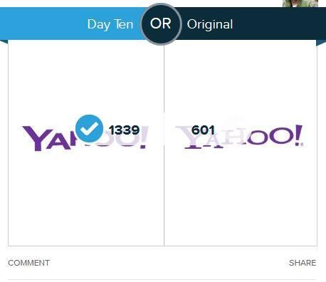
In a bid to get users involved with the selection process, Yahoo! is releasing a different logo every day leading up to their big logo reveal on September 5. New results indicate that people are taking an active role in deciding the new Yahoo! logo, a poll indicates that 66 percent of people prefer Yahoo!'s day 10 logo over their original logo. The day 10 logo is the most similar to the original compared to other options, it certainly keeps with Yahoo!'s signature typeface style, providing a fresher look without the serif accents. According to the polls conducted by Polar, 1,339 people favor the new day 10 logo, while 601 people indicated that they favored the current Yahoo logo.
Interestingly, the logos that are the biggest contrast from Yahoo!'s original logo do not resonate well with users. The two logos that used a completely new typeface were among the least-favored. On day 4, 3,505 people voted for the original Yahoo logo over that day's Yahoo logo, which only got 590 votes. Day 4's logo altered Yahoo!'s signature baseline and created a bold-ascending logo, which users simply did not like. In addition, another logo that wasn't well received was the day 6 Yahoo logo, which only garnered 250 votes against 2,329 for the current one.
As August winds down the new logo for a revamped Yahoo! will soon be decided upon, however the changes Mayer has been insisting upon are not anything new. The CEO and new mom was notably criticized when in February of 2013, she oversaw a major personnel policy change, requiring all remote-working employees convert to in-office roles, because Mayer had worked from home during the end of her pregnancy, she was criticized for the telecommuting ban. But now Mayer has changed Yahoo!'s maternity leave policy, lengthening it's time and even providing a cash bonus to parents.
RELATED:
iPhone 5S vs iPhone 5: The Latest Apple Smartphone Is 31 Percent Faster Due To New A7 Processor Chip
Samsung Sued By Brazilian Government For Poor Labor Conditions At Electronics Company's Assembly Lines
Facebook To Get Voice Recognition, Acquires Mobile Technologies That Developed Jibbigo
© 2025 Latin Times. All rights reserved. Do not reproduce without permission.


