Walmart's attempt to dazzle customers with a revamped logo isn't landing.
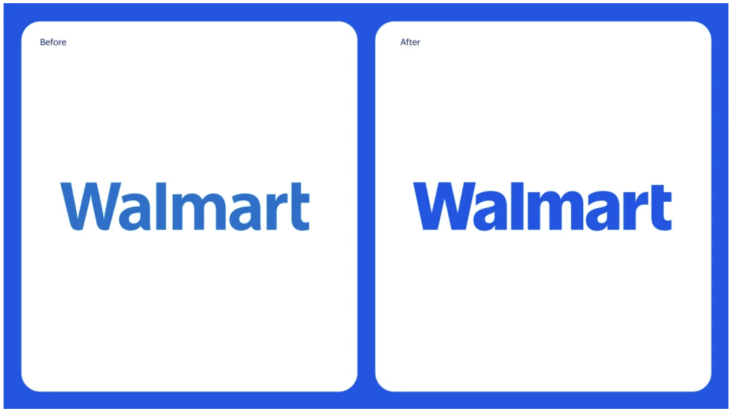
The company unveiled updated branding with promises of a "modern," culturally dynamic" identity. Still, internet users aren't buying it. The reason? The "new" logo looks almost identical to the old one.
Walmart unveils new logo for the first time in 17 years. pic.twitter.com/vsCdPAD2Dt
— Pop Base (@PopBase) January 14, 2025
"This is literally the same logo," one user scoffed on X.

"Riveting rebrand from Walmart," another chimed in sarcastically,.
"Oh so they just made the background darker lol," another commented.
The online sentiments are that the retail giant's bold claims of transformation don't quite match the reality of its design tweaks.
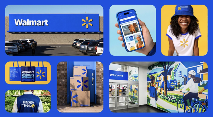
Walmart's official announcement painted a different picture. The company described its rebrand as a reflection of its evolution from a bargain retailer to "people-led" and "tech-powered."
"Walmart aims to be an inspirational, digital retailer that provides all the products, brands, and services our customers need and want," said William White, Walmart's Chief Marketing Officer, in the company's release.
Walmart discussed subtle updates to the logo, which include a "modern" font inspired by founder Sam Walton's trucker hat and a "refreshed" color palette that blends heritage tones of blue and yellow.
Yet these changes failed to resonate with many who found no distinctions between the old and new designs.

The rebrand is part of a larger rollout, with Walmart's updated branding already visible in select stores.
"The updated brand identity will help Walmart build credibility and connection," Walmart said.
Whether the branding grows on skeptical customers remains to be seen. For now, though, the internet's verdict is clear: Walmart's logo refresh is less "rebrand" and more rinse-and-repeat.
© 2025 Latin Times. All rights reserved. Do not reproduce without permission.


