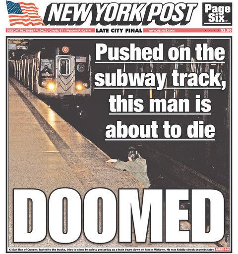
On Tuesday, Dec. 4, the New York Post published a picture that has many people outraged.
The picture was of a man on the tracks of the subway station in front of an oncoming train at the 49th Street station in Manhattan. The man can be seen holding onto the platform and ultimately the train crushed the man and the man later died at a hospital.
"Pushed on the subway track, this man is about to die," the caption read. "Doomed" was at the bottom of the page in big bold letters.
The New York Times' David Carr called the cover a "train wreck."
"The treatment of the photo was driven by a moral and commercial calculus that was sickening to behold," Carr wrote. "The Post cover treatment neatly embodies everything people hate and suspect about the news media business: not only are journalists bystanders, moral and ethical eunuchs who don't intervene when danger or evil presents itself, but perhaps they secretly root for its culmination."
The photo was taking by Post freelance photographer R. Umar Abbasi and he said everything happened so quickly and he could not reach the victim because the train was moving faster than he could've gotten there.
Bethany Swain, lecturer at the University of Maryland and member of the National Press Photographers Association board of directors, said although the journalistic value of the image was not worth the man's life, the heat should not be put on the photographer.
"Stop blaming the photographer and direct the anger and energy into developing a system to better deal with mental illness" Swain told Gawker. "From the details in the New York Post article, it is the disturbed gentleman who pushed Ki Suk Han who is to blame in his death, not the photographer who couldn't stop the collision."
On Twitter, many people lashed out on the Post's decision to post the cover.
"NY post is to news paper what Fox is to informations- your cover was seriously outrageous, shame on you," Elise Ruggeri tweeted.
One user called the cover "inhumane and sickening." Another user declared that the cover was making him "sick."
On the Post's comment board, people are generally upset.
One reader said even if the moment was captured, it should not have been submitted for publishing. He called the move "disrespectful on my levels" and said the photographer "should be strangled by his own camera strap."
Another user called the cover page 'extremely rude, tasteless and disgusting." She also said that she hopes that "Americans awake up and realize how crude that was of the New York Post and can make the right choice and no longer purchase the daily edition."
© 2025 Latin Times. All rights reserved. Do not reproduce without permission.


